TEXT by CATHERINE ETTLINGER • PHOTOGRAPHY by TREVOR TONDRO
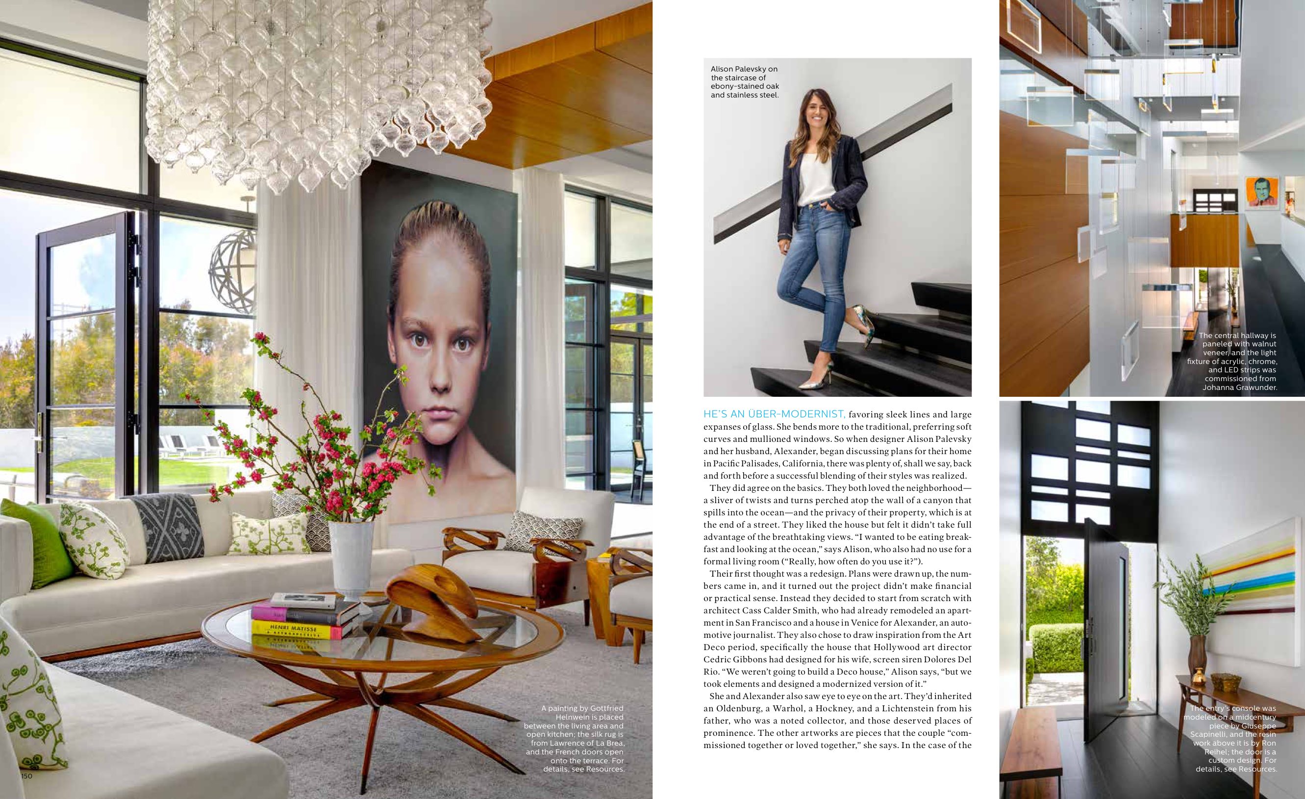
HE’S AN ÜBER-MODERNIST, favoring sleek lines and large expanses of glass. She bends more to the traditional, preferring soft curves and mullioned windows. So when designer Alison Palevsky and her husband, Alexander, began discussing plans for their home in Pacific Palisades, California, there was plenty of, shall we say, back and forth before a successful blending of their styles was realized.
They did agree on the basics. They both loved the neighborhood— a sliver of twists and turns perched atop the wall of a canyon that spills into the ocean—and the privacy of their property, which is at the end of a street. They liked the house but felt it didn’t take full advantage of the breathtaking views. “I wanted to be eating breakfast and looking at the ocean,” says Alison, who also had no use for a formal living room (“Really, how often do you use it?”).
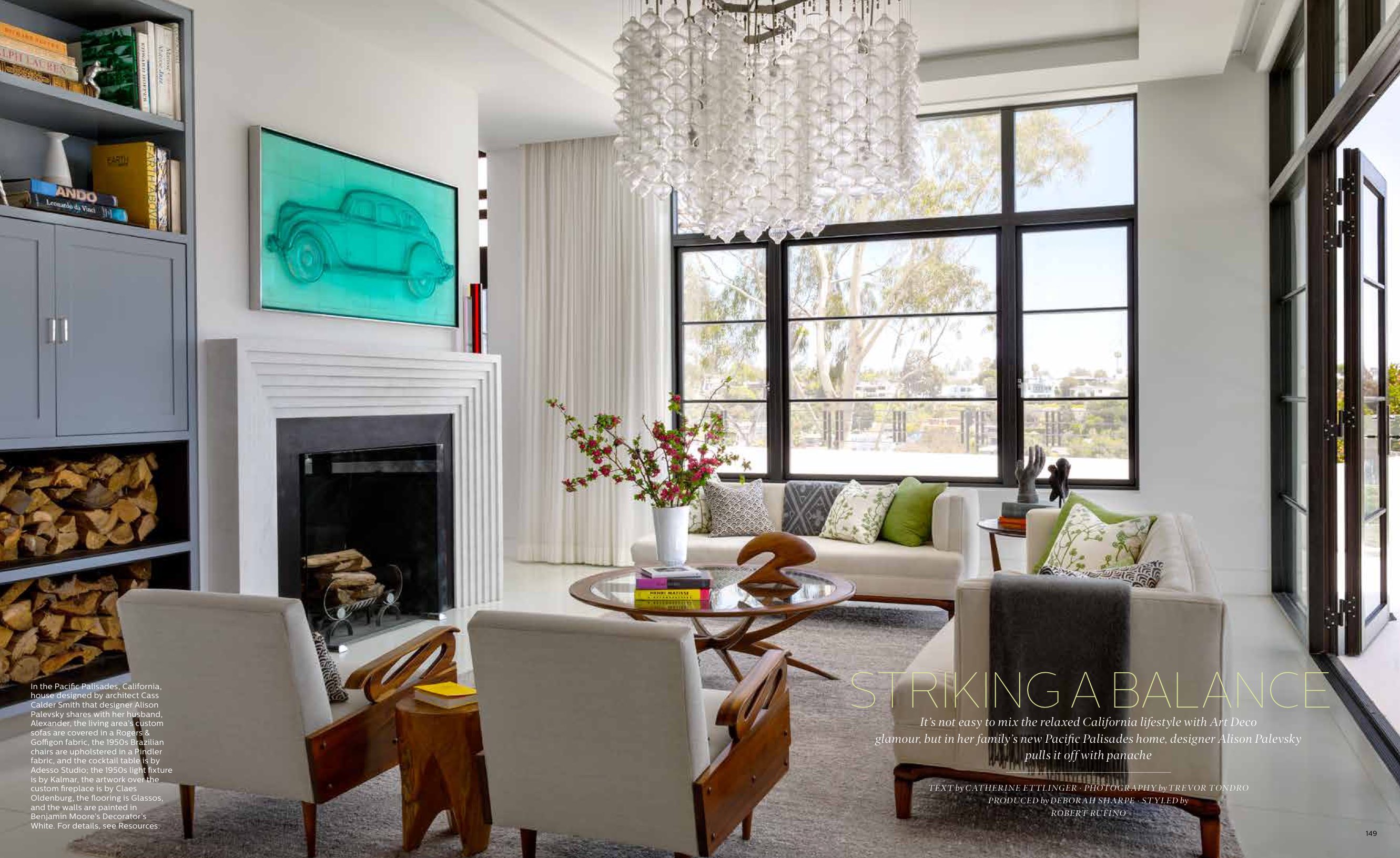
Their first thought was a redesign. Plans were drawn up, the numbers came in, and it turned out the project didn’t make financial or practical sense. Instead they decided to start from scratch with architect Cass Calder Smith, who had already remodeled an apartment in San Francisco and a house in Venice for Alexander, an automotive journalist. They also chose to draw inspiration from the Art Deco period, specifically the house that Hollywood art director Cedric Gibbons had designed for his wife, screen siren Dolores Del Rio. “We weren’t going to build a Deco house,” Alison says, “but we took elements and designed a modernized version of it.”
She and Alexander also saw eye to eye on the art. They’d inherited an Oldenburg, a Warhol, a Hockney, and a Lichtenstein from his father, who was a noted collector, and those deserved places of prominence. The other artworks are pieces that the couple “commissioned together or loved together,” she says. In the case of the overscale Gottfried Helnwein portrait of a child, positioned between the kitchen and living area, the house was actually designed to accommodate the art.
On all this, they were perfectly in sync.
The rest, not so much.
When they started the project, Alison had been immersed in the design business for nearly two decades and naturally had strong convictions. She began her career working for designers Martyn Lawrence Bullard and Trip Haenisch, then moved on to a brief stint with Greg Grande, who was the set decorator for Friends. After that, she and a partner launched SPI Design, and two years ago, she went out on her own. This past January she opened the doors to her Brentwood studio, where she showcases her own line of furniture, XPalevsky, along with a carefully curated mélange of art and accessories—all of it ensconced in an intimate setting that allows clients to visualize, say, how one of her gently curved sofas or silkfringed brass chandeliers might look in their homes.
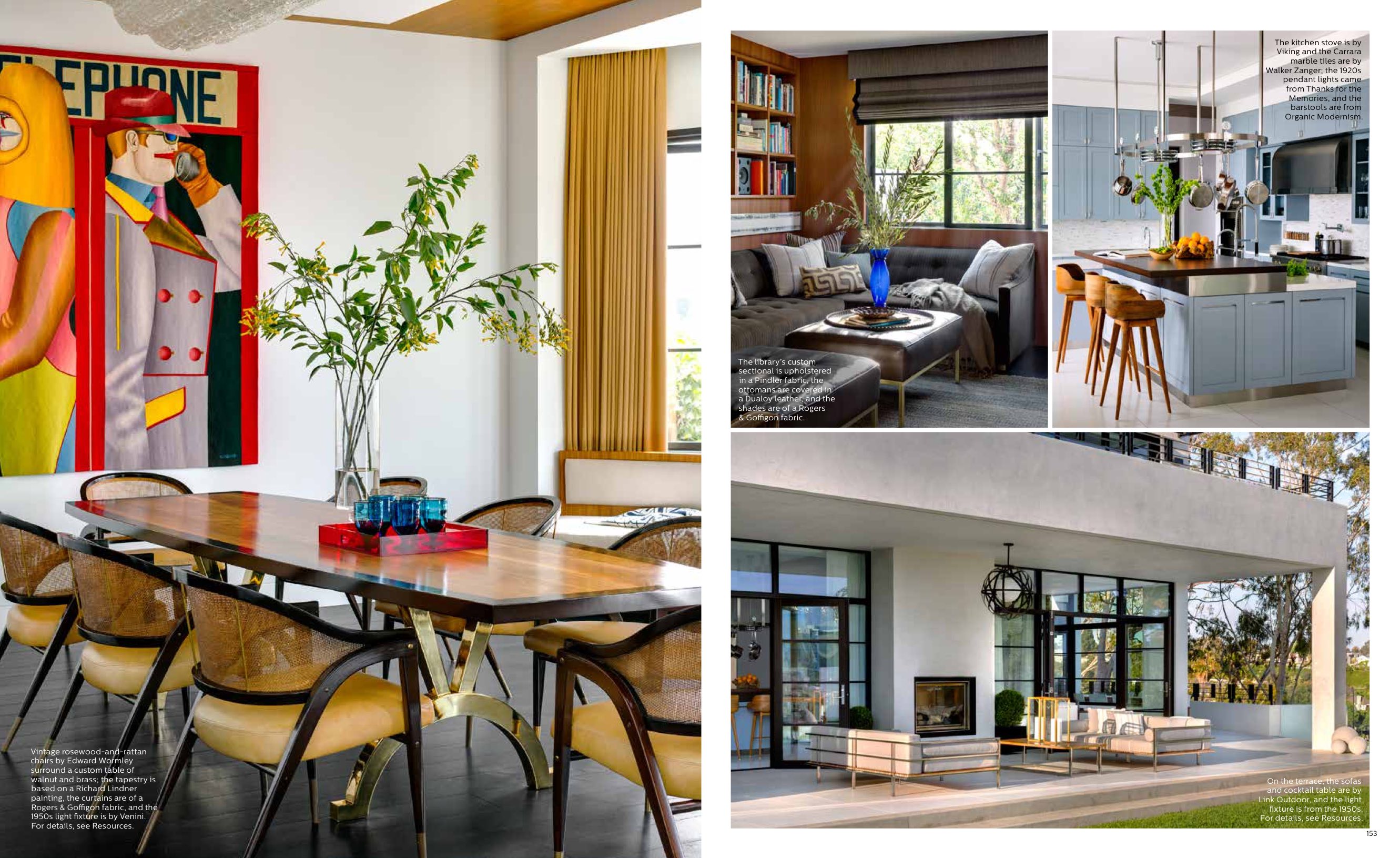
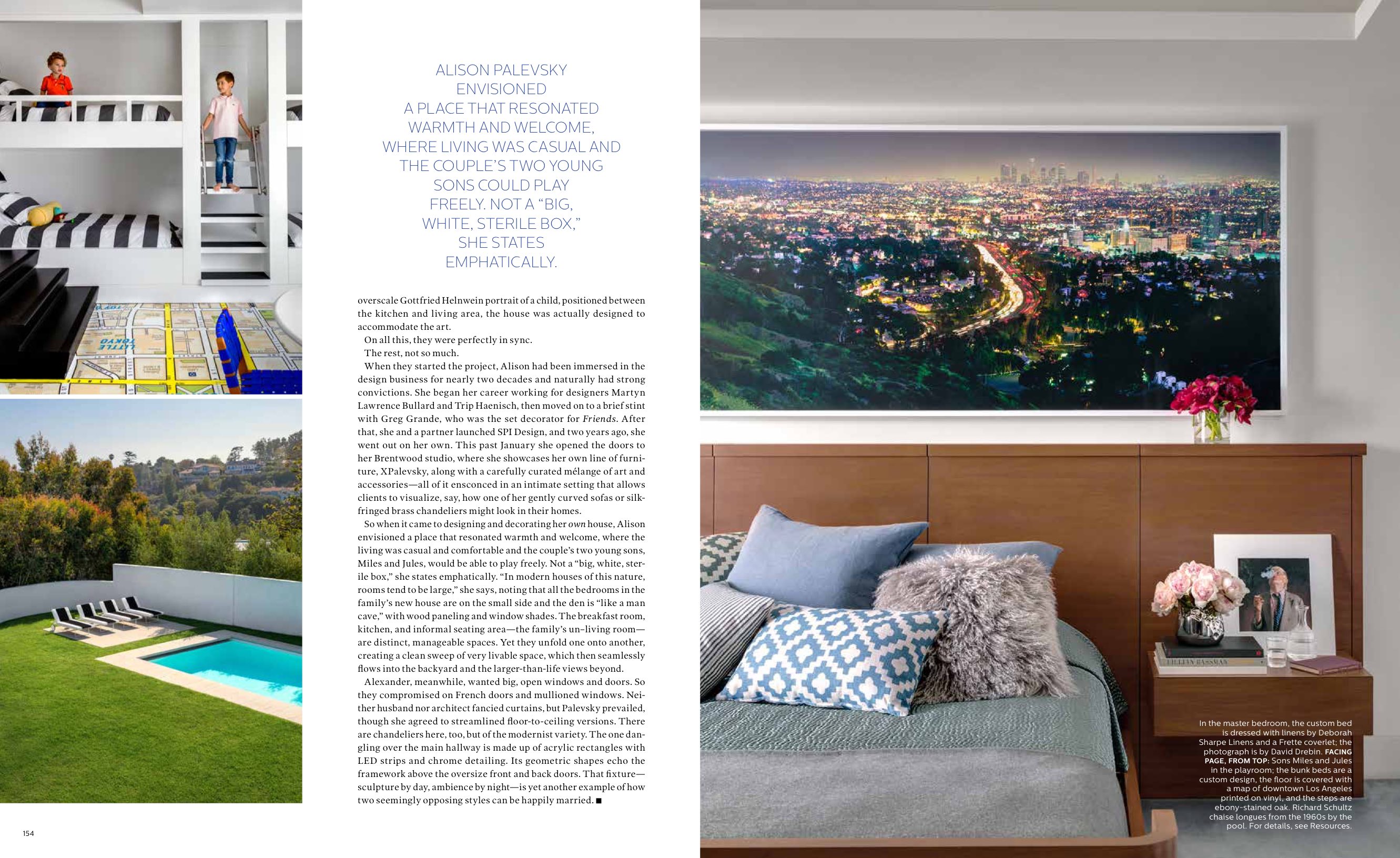
So when it came to designing and decorating her own house, Alison envisioned a place that resonated warmth and welcome, where the living was casual and comfortable and the couple’s two young sons, Miles and Jules, would be able to play freely. Not a “big, white, sterile box,” she states emphatically. “In modern houses of this nature, rooms tend to be large,” she says, noting that all the bedrooms in the family’s new house are on the small side and the den is “like a man cave,” with wood paneling and window shades. The breakfast room, kitchen, and informal seating area—the family’s un–living room— are distinct, manageable spaces. Yet they unfold one onto another, creating a clean sweep of very livable space, which then seamlessly flows into the backyard and the larger-than-life views beyond.
Alexander, meanwhile, wanted big, open windows and doors. So they compromised on French doors and mullioned windows. Neither husband nor architect fancied curtains, but Palevsky prevailed, though she agreed to streamlined floor-to-ceiling versions. There are chandeliers here, too, but of the modernist variety. The one dangling over the main hallway is made up of acrylic rectangles with LED strips and chrome detailing. Its geometric shapes echo the framework above the oversize front and back doors. That fixture— sculpture by day, ambience by night—is yet another example of how two seemingly opposing styles can be happily married.


